Natour
← Back to chapters

May 2025 - Learning & Study Tools

[UI · Responsive Layout] - Lesson Overview Sheet

textpost · published

Attachments

🎭 Scenario

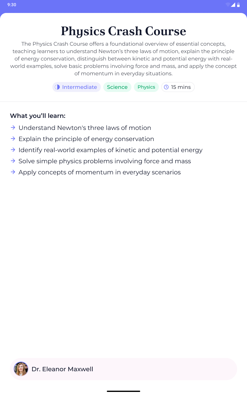
A student opens their tablet, ready to review their lessons… only to find a stretched-out, sad-looking mobile layout crying for help. Whether it’s a phone or a tablet, the lesson list should look like it belongs. You’re here to fix that and give every device a lesson in proper UI.


🎯 Feature Goal

Design a responsive lesson overview screen that adapts its layout gracefully between phone and tablet sizes.

📌 Requirements

ℹ️You can find a downloadable PDF with the complete requirements in the Resources section👉🏼

  • Solid colour background (edge-to-edge)
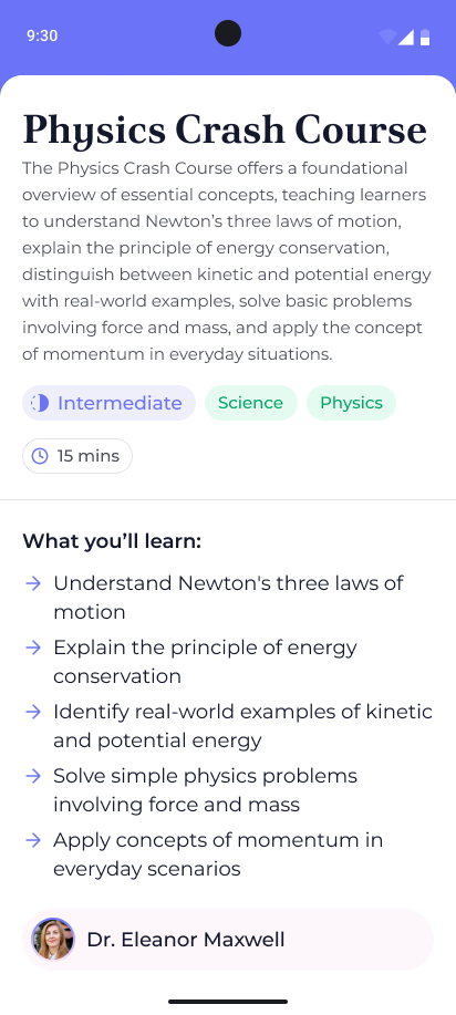
  • Box with rounded top corners with a white background

    • It contains the main content of the screen

    • Fills all available space

    • Does not render beneath the status bar

    • Does render underneath the navigation bar

  • Title text at top of screen

    • Left (start) aligned when device is in portrait mode

    • Center aligned when device is in landscape mode or tablet

  • Description text underneath the title

    • Left (start) aligned when device is in portrait mode

    • Center aligned when device is in landscape mode or tablet

  • Row of chips

    • Left (start) aligned when device is in portrait mode

    • Center aligned when device is in landscape mode or tablet

    • Chips Row should wrap to the next line

  • Class difficulty chip

    • Has a colour associated with the difficulty (easy, intermediate, hard)

    • The intermediate one must be present in the final designs

    • Leading icon with text

  • Topic tag

    • Simple with text and green background

  • Duration chip

    • Leading clock icon with the time in minutes

  • Divider underneath the row of chips

  • Scrollable section

    • Text: “What you’ll learn:”

      • Bold text

    • Bulleted list below the heading

      • Each item starts with an arrow instead of a traditional bullet

      • Text should wrap to the next line when it reaches the edge of the screen

  • Footer content

    • Rounded rectangle component with light pink background

    • Leading Profile icon cropped into a circle

    • Name of the professor: “Dr. Eleanor Maxwell”


🤔 What's Allowed?

  • Standard Android/Jetpack libraries

  • No 3rd party libraries are allowed or would be required to complete this challenge

🧠 Disclaimer

  • Pure UI challenge

  • This challenge tests your ability to stretch your Compose skills—because great UIs should flex on both phones and tablets!


🏆 Submission & Rewards

  • A successful submission of this challenge via the /submit-challenge command on Discord grants you 100 XP. You can use it in any channel on Discord :)

  • A successful submission consists of these parts

    1. A link to a Gist showing your code for this challenge.

    2. A screenshot of your final design
[Text-to-Speech · Randomization · UI] - Daily Word Card

textpost · published

Attachments

🎭 Scenario

You’re halfway through your morning coffee when your brain reminds you: “We agreed to learn one new word a day, remember?” But dictionaries are long. Flashcards are lost. And your cat sat on your notes. Thankfully, a genius idea hits: a minimalist app that serves one word and its meaning daily, spoken aloud so even your half-asleep self can absorb it. Sounds great, right?

Yeah, well… now you have to build it—time to ship that Word of the Day screen.


🎯 Feature Goal

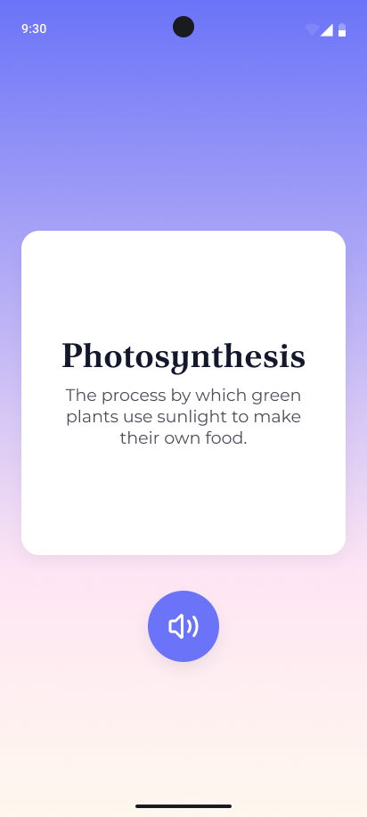
Create a single-screen “Word of the Day” experience that displays a randomly selected word and definition in a clean, focused card layout, with a one-tap button to hear both read aloud via Text-to-Speech.

📌 Requirements

ℹ️ You can find a downloadable PDF with the complete requirements in the Resources section👉🏼

  • On launch, pick one of the words with its definition to show in the UI

    • You can find all words with their definitions in the Resources section👉🏼

  • Vertical gradient background that consists of three (3) colors

    • The gradient must be edge-to-edge (i.e. it must render underneath the system bars)

  • Centered content

    • Card component with a title and description text

    • An icon button below the card containing a volume icon

  • When the button is tapped, the title and description text need to be read aloud (not by you but by the device!).


🤔 What's Allowed?

  • Standard Android/Jetpack libraries

  • No 3rd party libraries are allowed or would be required to complete this challenge

🧠 Disclaimer

  • This challenge tests your “wordsmanship” in Compose layouting, styling, and TTS basics—no definition dodging allowed!


🏆 Submission & Rewards

  • A successful submission of this challenge via the /submit-challenge command on Discord grants you 100 XP. You can use it in any channel on Discord :)

  • A successful submission consists of these parts

    1. A link to a Gist showing your code for this challenge.

    2. A screenshot of your final design
[Search · Filtering · UI · State Management] - Searchable Study List

textpost · published

Attachments

🎭 Scenario

You’re cramming for an exam with 20 tabs open, a study list somewhere in there, and brain cells slowly melting. You try to find that one topic on “clouds,” but your scroll finger files a complaint. Enough is enough. It’s time for a filtered, focused study list that listens as you type. Lucky for future-you, you’re building it now.


🎯 Feature Goal

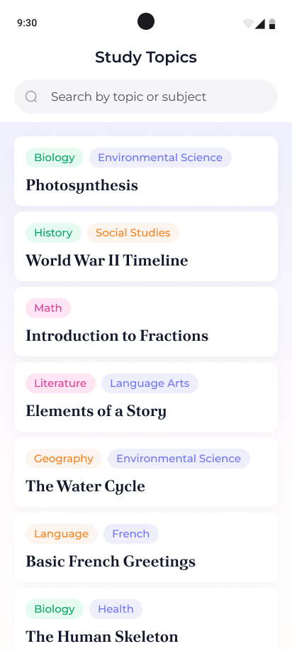
Create a scrollable study topic list with a real-time search bar that filters items by either title or subject using a single intuitive text input.

📌 Requirements

ℹ️ You can find a downloadable PDF with the complete requirements in the Resources section👉🏼

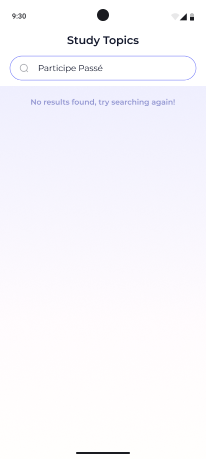
  • Title text: “Study Topics”

  • Search bar underneath

    • Has a leading icon that is always visible

    • Hint text: “Search by topic or subject”

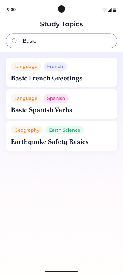
    • As the user inputs text, the list of topics should be updated

      • The logic should have a short (300 millisecond) delay before running to prevent running the logic for each character

      • The search functionality must perform a case-insensitive match against both the topic title and any of its associated subject tags. As the user types into the search bar, the list should dynamically filter to include any item where the input text matches either:

        • The topic title (e.g. “Skeleton” matches “The Human Skeleton”), or

        • Any of the subjects associated with that topic (e.g. “Biology” returns topics like “Photosynthesis” and “The Human Skeleton”).

      • If the input is empty, the full list should be shown. If no matches are found, display a friendly message: “No results found, try searching again!”

  • The main content is a scrollable list of study topics

  • Each card

    • contains a row of subjects the topic relates to (overflow goes to a second line)

    • Below is the text of the topic

    • Rounded corners

ℹ️ List of all study topics with their subject tags can be found in the Resources section 👉🏼


🤔 What's Allowed?

  • Standard Android/Jetpack libraries

    • Checkout the debounce intermediary Flow operator to delay the search logic when the text input changes👀

  • No 3rd party libraries are allowed or would be required to complete this challenge

⚠️ What's not important

  • Perfect recreation of the mockup - it just needs to reasonably resemble the mockups

  • Responsiveness across every device size or orientation is not mandatory.

🧠 Disclaimer

  • This challenge is like speed dating for study topics—type a few letters, and watch them line up to impress you. Just don’t ghost your state management.


🏆 Submission & Rewards

  • A successful submission of this challenge via the /submit-challenge command on Discord grants you 100 XP. You can use it in any channel on Discord :)

  • A successful submission consists of these parts

    1. A link to a Gist showing your code for this challenge.

    2. A screen recording (40s max) showcasing:

      1. Search for any topic

      2. Clear text and search for any subject

      3. Clear text and search for “Foo Empty”

      4. Show empty state

[Responsive Layout · Scroll/Paging · UI · State Management] - Study Feed Switcher

textpost · published

Attachments

🎭 Scenario

You launch a sleek new study app and everything looks perfect—until someone tilts their phone sideways and the vertical list just… stays vertical. Awkward. Meanwhile, tablets are stuck pretending to be giant phones. Let’s face it: your feed needs to adapt. Whether users scroll or swipe, one card at a time should shine like it belongs there.

Time to make your feed smarter than gravity.


🎯 Feature Goal

Create a fullscreen, responsive feed of lesson cards that switches between vertical scrolling and horizontal paging based on device orientation and screen size, using adaptive layout techniques.

📌 Requirements

ℹ️You can find a downloadable PDF with the complete requirements in the Resources section👉🏼

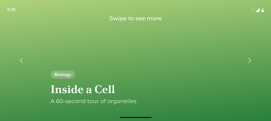
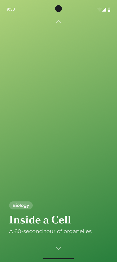
  • Full screen list items “feed” where each item has a background, and info block

  • Full screen (edge-to-edge) background

    • The colour gradient depends on the content show. See the full list below the requirements section

  • Study topic info column block

    • Chip with text that represents the subject the topic is related to

    • Title of the study topic. Overflow text should wrap to the next line

    • Short description of the study topic. Overflow text should wrap to the next line

    • Always placed at the bottom left corner of the screen

  • Chevron icons visible at the opposite edges of the screen pointing to each edge of the scroll direction of the feed

    • Top and bottom placement: phone and tablet potrait mode

    • Start and end placement: phone and tablet in landscape mode

    • The feed should loop through the items, meaning when at the first item, the user can scroll to the last item or the 2nd item in the list

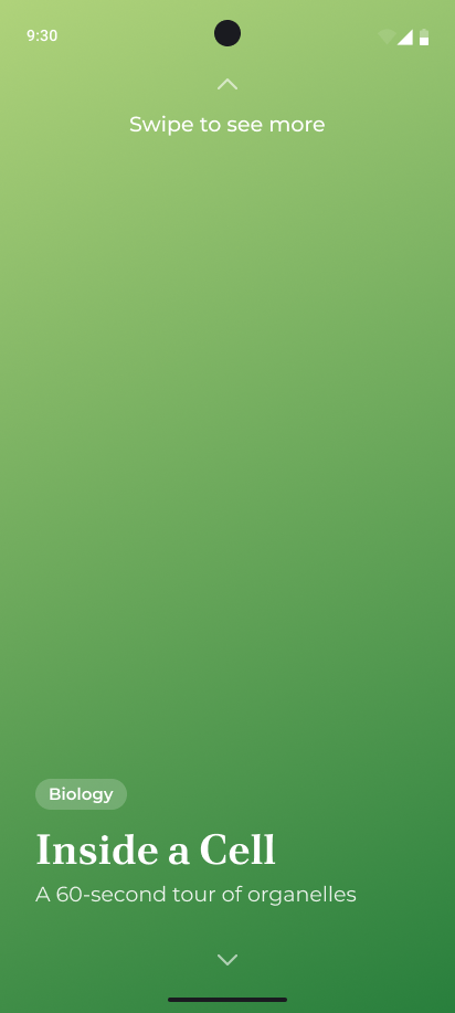
  • “Swipe to see more” text

    • Always placed at the top centre of the screen

    • Only visible when the user has not scrolled for more than three (3) seconds

    • Text should have a slight fade in and out animation while visible

    • Hide the text once the user scrolls

ℹ️ You can find a list of lessons in the resources section 👉🏼


🤔 What's Allowed?

  • Standard Android/Jetpack libraries

  • No 3rd party libraries are allowed or would be required to complete this challenge

⚠️ What's not important

  • Perfect recreation of the mockup - it just needs to reasonably resemble the mockups

🧠 Disclaimer

This challenge flips your layout logic on its head—literally. Get ready to scroll with the flow and master Compose responsiveness like a pro.


🏆 Submission & Rewards

  • A successful submission of this challenge via the /submit-challenge command on Discord grants you 200 XP. You can use it in any channel on Discord :)

  • A successful submission consists of these parts

    1. A link to a Gist showing your code for this challenge.

    2. A screen recording (40s max) showcasing how you scroll between the feed items. Change the orientation of the device during the recording and continue scrolling.

      1. Recording can be done with Tablet or Phone

[List Management · Navigation · UI · State Management] - Scrollable Study Board

textpost · published

Attachments

🎭 Scenario

You open a study app, ready to find that one lesson about volcanoes… and instead, get lost in a never-ending scroll swamp. There’s no progress bar, no way to jump around, and worst of all—you just scrolled past item #49 only to realize you were looking for #3. Clearly, this isn’t just a list—it’s a battlefield. One only a brave Compose dev like you can tame. Let’s organize the chaos into a scrollable, tappable, jumpable, pinnable, and just plain usable study board.


🎯 Feature Goal

Develop a responsive and fully interactive study content board with 50+ categorized items, supporting sticky headers, pinning, index tracking, scroll-to-jump with visual highlight, and smooth scroll state preservation.

📌 Requirements

ℹ️You can find a downloadable PDF with the complete requirements in the Resources section👉🏼

Main Screen

  • Gradient background colorSolid background color

    • ℹ️ Due to the complexity of making a sticky item’s background match a gradient—especially with transparency causing other items to scroll underneath and remain visible—we’ve changed it to use a solid background color instead.

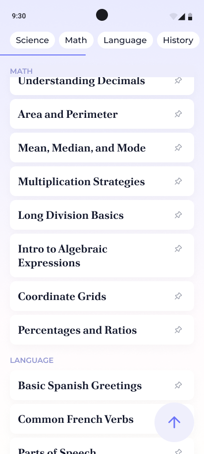
  • Scrollable row of chips that each contain the name of a subject

    • On tap, smooth scroll the list to the heading matching the chip tapped

    • The chips are not selectable and do no have a selected state

  • Edge to edge progress bar underneath the row of chips

    • Represents how far the user has scrolled in the list of study topics

    • The progress bar is at 0% when the first item in the list is visible

    • The progress bar is 100% when the last item in the list is visible

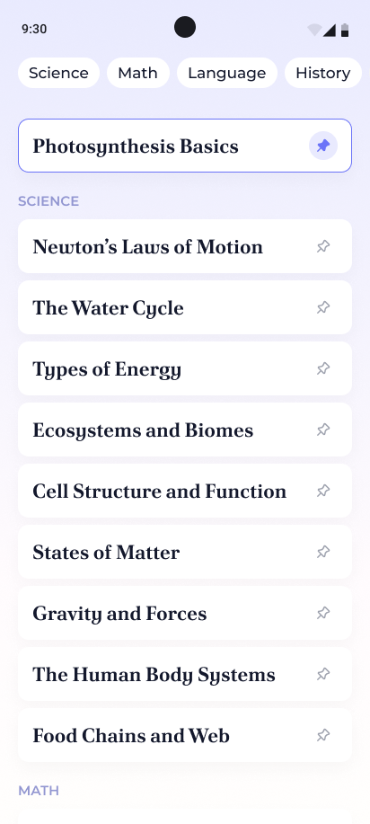
  • Pinned section

    • Underneath the progress bar is space for up to 5 pinned list items

    • Each pinned card:

      • Has a colored border to highlight it

      • Content includes the name of the study topic and at the far right a colored pin icon with circle background

      • When the colored pin is tapped, unpin the study topic and move it back into the main content list

    • Pinned items are placed in a column with a new item being placed at the bottom of the list

    • List of pinned items are not scrollable

  • Main Content - Scrollabe list of study topics

    • Fills the remaining available screen space

    • Each list item:

      • Rounded corners with a study topic and a pin icon in a row

      • Tap the pin icon to pin the item and remove it from the scrollable list

        • Trying to pin an item when five (5) are already pinned shows a snackbar with a relevant error message of your choosing.

      • On tap, navigate to the detail screen

        • After returning from the detail screen, the scroll position must remain where it was before navigating to this screen

    • Each study topic is associated with a subject. Organise the list into these subjects and add sticky headers for each subject

    • Show a FAB at the bottom right corner

      • Only visible when the first 10 items in the list are no longer visible

      • Contains an arrow pointing up icon

      • On FAB tap, smooth scroll to the top of the list so that the first list item is visible

    • Before the user reaches the end of the list, show a snackbar with text: “Reaching the end of the list!”

      • When the user only has 10 more items that need to be revealed, then show this snackbar

      • This should not be shown when the above condition is met while the list autoscrolls

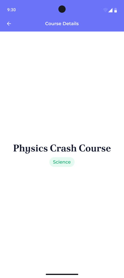
Detail Screen

  • Top bar

    • Back arrow icon

      • On tap navigate back to the main screen

    • Centered title text: “Course Details”

  • Center of screen is the name of the study topic tapped with its subject category underneath it

ℹ️ You can find a list of study topics in the resources section 👉🏼


🤔 What's Allowed

  • Standard Android/Jetpack libraries

  • No 3rd party libraries are allowed or would be required to complete this challenge

⚠️ What's not important

  • Responsiveness across every device size or orientation is not mandatory.

🧠 Disclaimer

This is the boss battle of list management—where scrolls grow wild, headers stick like glue, and only the brave tame the chaos with clean state and clever code. No lazy devs in this LazyColumn 😁


🏆 Submission & Rewards

  • A successful submission of this challenge via the /submit-challenge command on Discord grants you 300 XP. You can use it in any channel on Discord :)

  • A successful submission consists of these parts

    1. A link to a Gist showing your code for this challenge.

    2. A screen recording (50s max) showcasing the following:

      1. Scroll to the end of the subject chips row

      2. Select the last subject chip

      3. After the list scrolls to the subject heading pin any 5 list items

      4. Try to pin a sixth (6th) item

      5. Tap on any of the visible list items to navigate to the details screen

      6. Navigate back to the main screen

      7. Use the FAB to scroll to the top of the screen

      8. Unpin one of the pinned items

      9. Manually scroll to the bottom of the list until the snackbar is shown to inform user they are nearing the end of the list